Tumi Tegra-lite Brand Development
Brand campaign naming (internally referred as VaporXT) and creative development across all platforms, used across Tumi global marketing.
CAMPAIGN DEVELOPMENT
ART DIRECTION
RETOUCH DIRECTION
VISUAL
DESIGN
NAMING
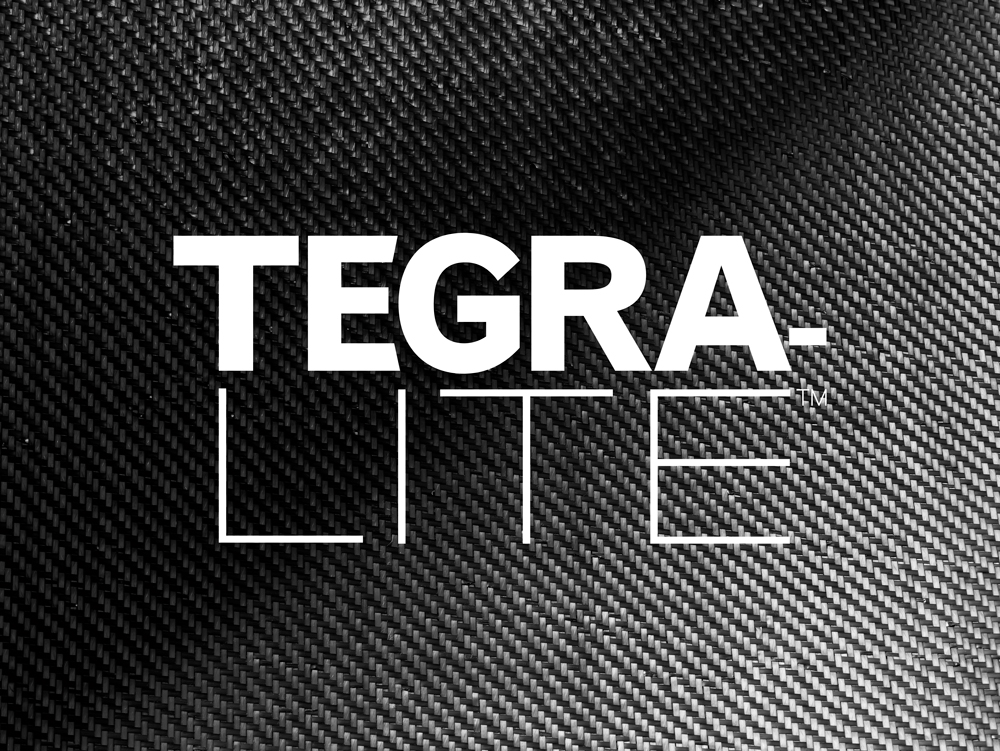
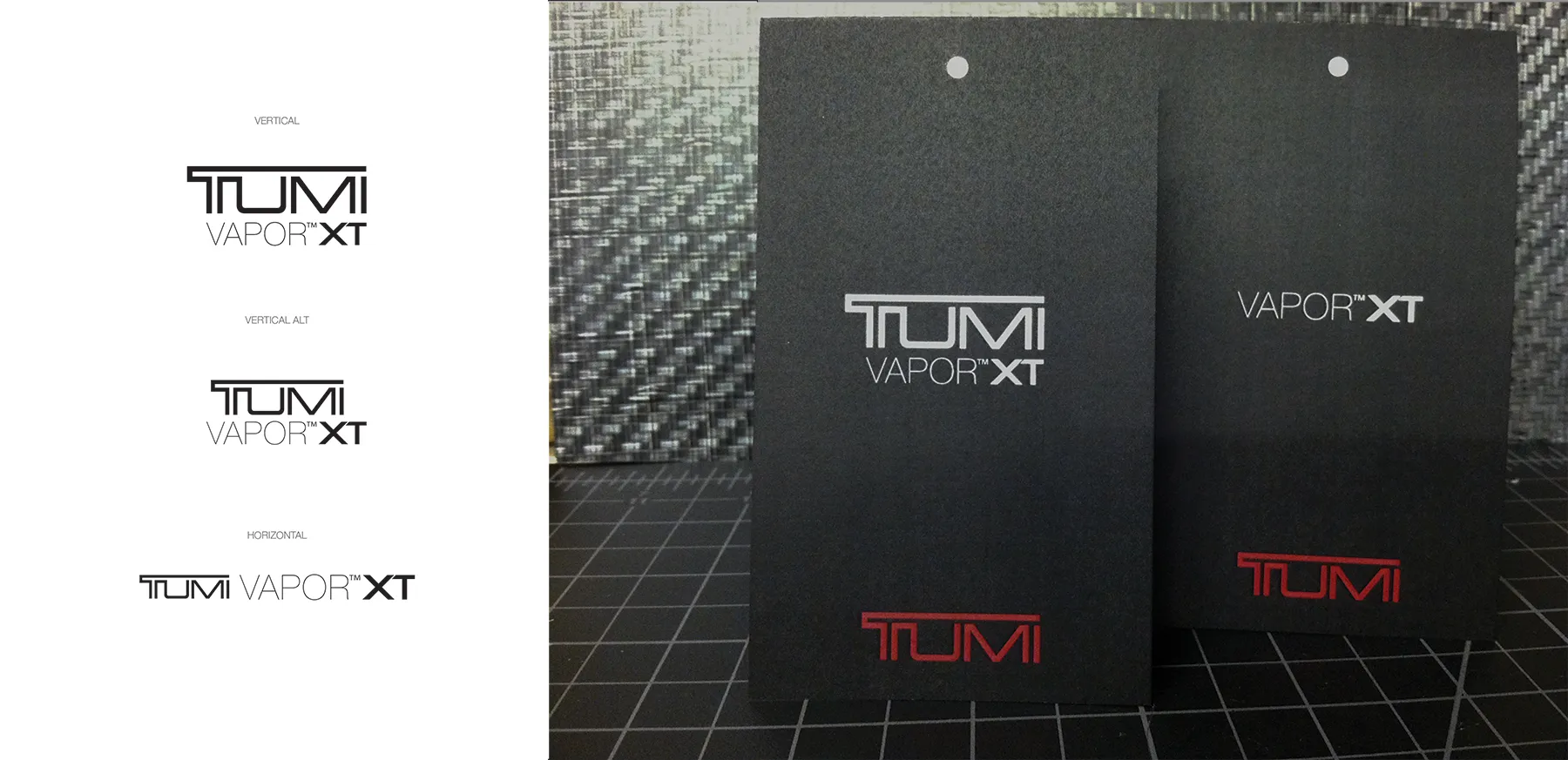
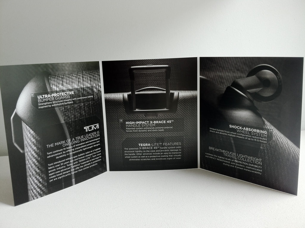
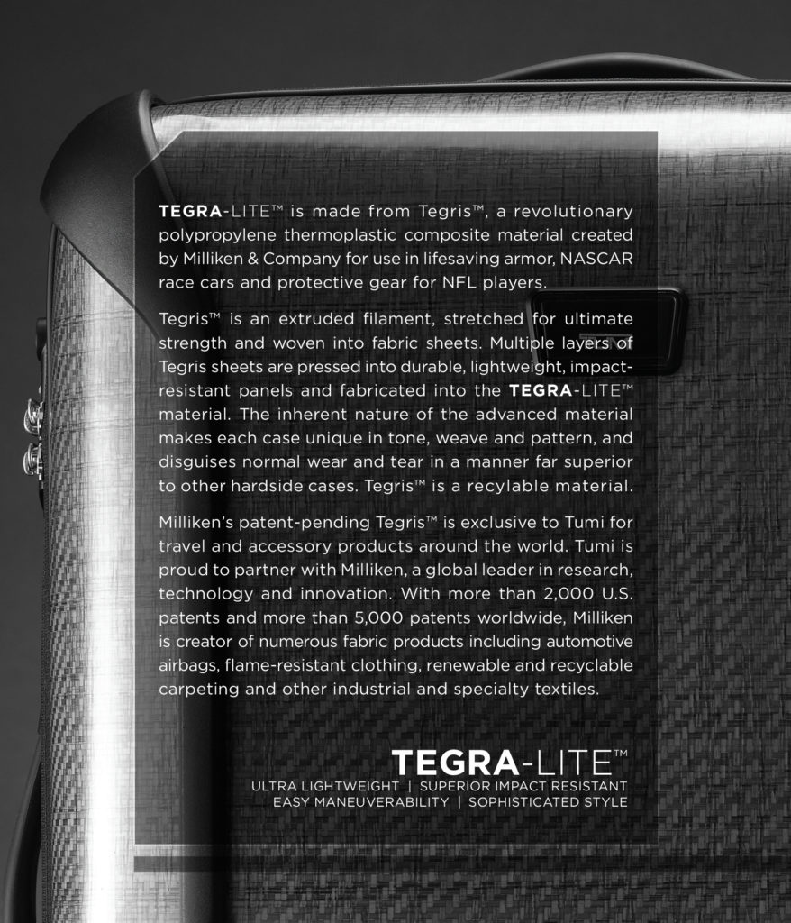
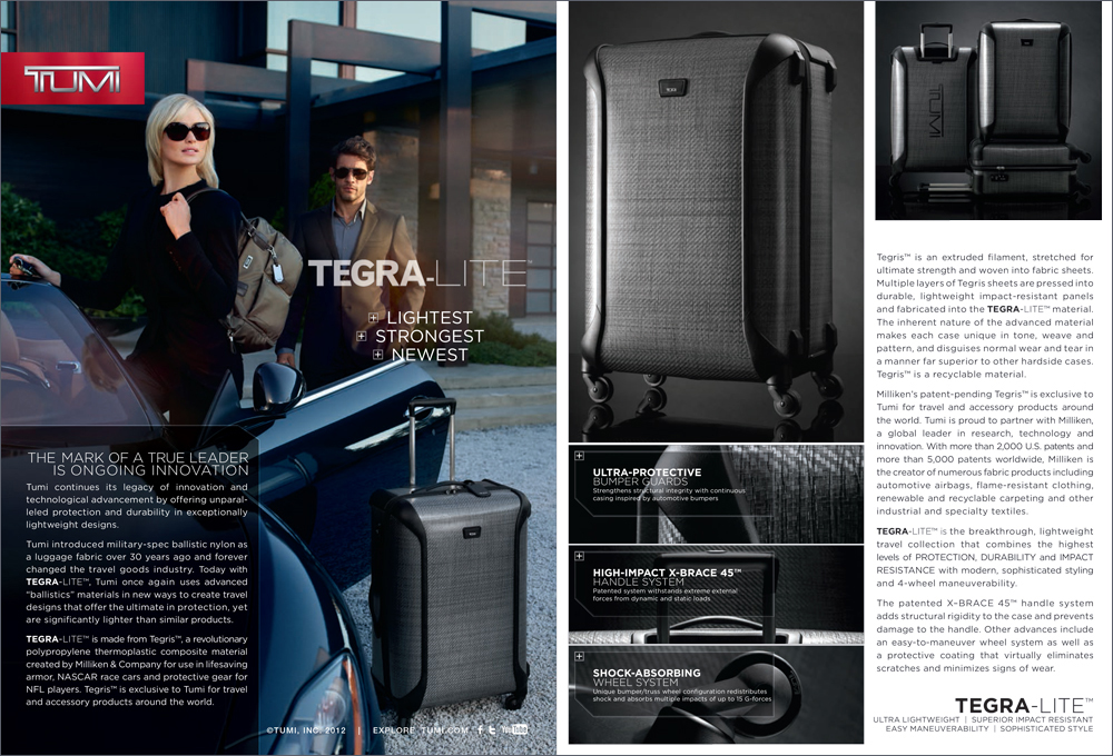
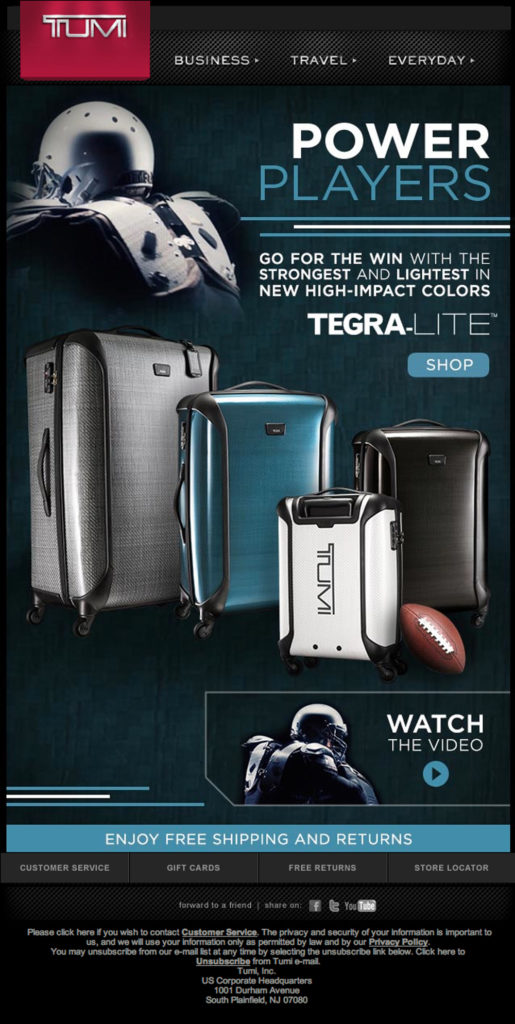
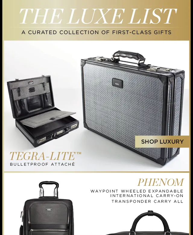
For the first several months at Tumi the campaign had not been developed yet, in fact it was referred to as Vapor™XT (shown is one example of some lockups I put together that were sent out). But Tegra-lite really was its own thing. Made from ballistic fabric like all of Tumi’s fabrication, it was the Tegris® material (used in the military armour, kevlar vests and football gear) that defined Tegra-lite and truly set it apart from Vapor. Later we touted a bullet-proof case.
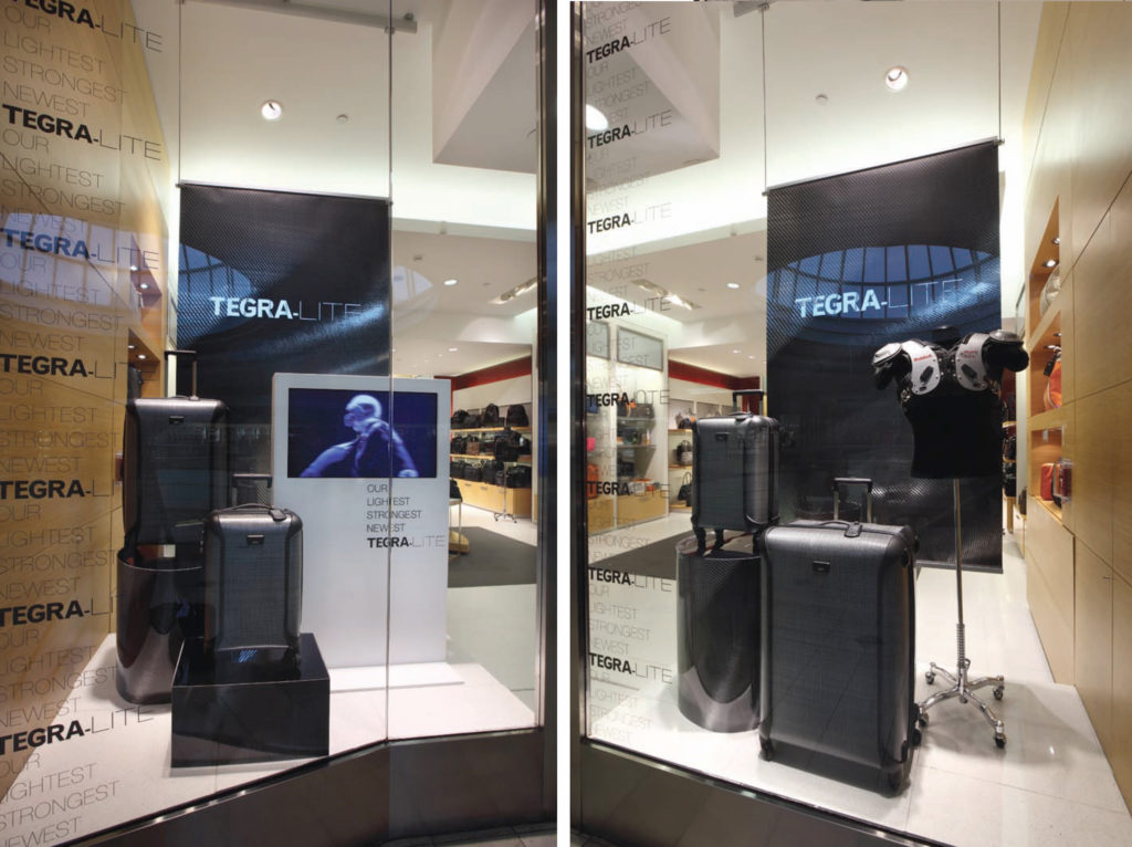
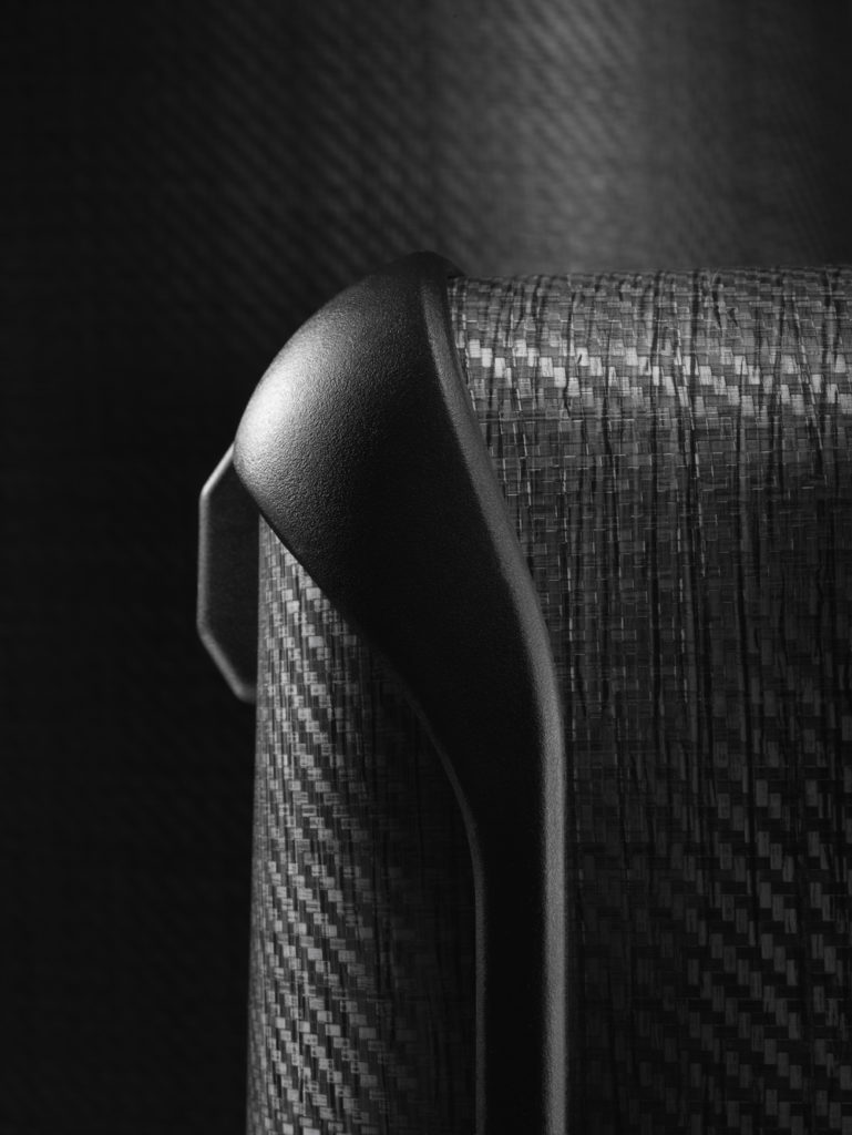
When I sat down with Stephen Chambers (Visual) to concept this campaign from windows down, we wanted to show the undulations in the fabric to show off its sheen, and I felt that shooting tight crops (which was a bit of convincing, not showing the whole product), was more about the form the way luxury cars are shot. At that time, Tumi products were shot very light, full form and this woud immediately, not only feel different but hopefully move the creative in a more modern direction. Later, I refreshed the Vapor campaign, with a high gloss, colorful contrast. Stephen and I both came from fashion. Storefronts at Tumi vary in size from small shops like the terminal location at Grand Central to sweeping freestanding buildings. A softer textural backdrop would bridge the gap from the old creative regime at Tumi.
A few product samples and fabric were on set within a few months. The most immediate need was windows and an instore piece. In the background I was developing the logo in rounds of approvals with legal. After that things moved quickly and the branding moved across all channels from hangtag and hoardings.
Printer
- Earth Color
VP of Visual Merchandising
- Stephen Chambers
Web Designer